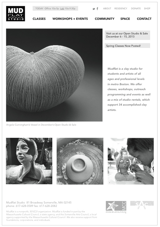
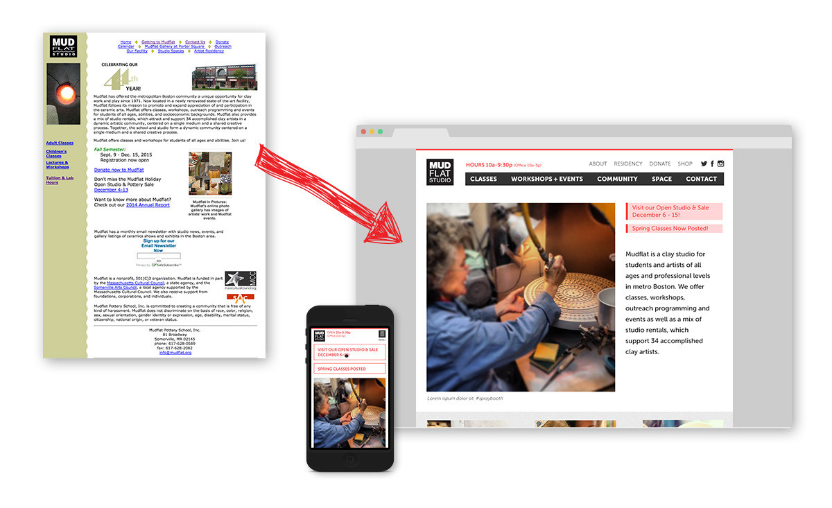
When I first laid eyes on Mudflat's website, I didn't expect much from the studio. The site was outdated, clunky and uninspiring. However, when I stepped foot in to the space, I had the exact opposite reaction. The studio, which is a remodeled theater, is stunning. It's full of light, air, space and happy ceramic artists. The caliber of professional work from the community is astounding, yet total beginners will feel right at home in any of the classes. As a member, I wanted to remedy the disconnect between the outdated online presence and the actual studio, which is modern, friendly, spacious and professional. I also wanted to create a site that was easier to use for prospective students and the current community.

Interviewing the Community & Reviewing Analytics
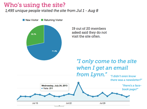
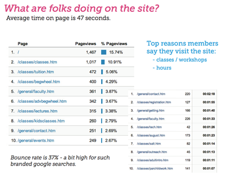
To begin, I set about interviewing the community and setting up analytics to learn about current site usage. We learned thateven the current community was unaware of many of Mudflat's online tools. We also confirmed that the main site's goal was to inform current and prospective students about classes, workshops and hours. The studio director was surprised to learn that many of the artists and students were interested in helping create content for the site and possibly even help managing their own artist bio pages to help demonstrate the level of professional work coming from the studio.
The following slides are from the analytics audit and user interviews:
Simplifying Site Structure
Once we finished interviews and the analytical review, we were able to focus on designing an experience with an improved navigation structure, better class/workshop way-finding, online registration and an increased sense of community.
The following sitemap leads with conversion critical sections for classes and workshops. The new navigation also allows the studio to highlight the community and the physical space.
The following sitemap leads with conversion critical sections for classes and workshops. The new navigation also allows the studio to highlight the community and the physical space.

Anticipating Content Management
Due to the hectic nature of running a studio, we decided to take advantage of media publishing apps such as instagram and tagging structures to allow staff to regularly update the homepage media with impromptu inspiration. This strategy keeps managers in the classes and not on their computers dealing with complex web editing!
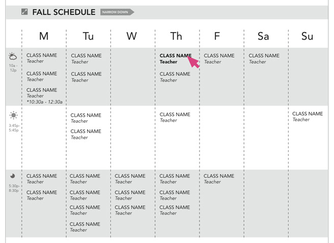
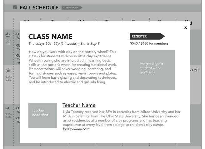
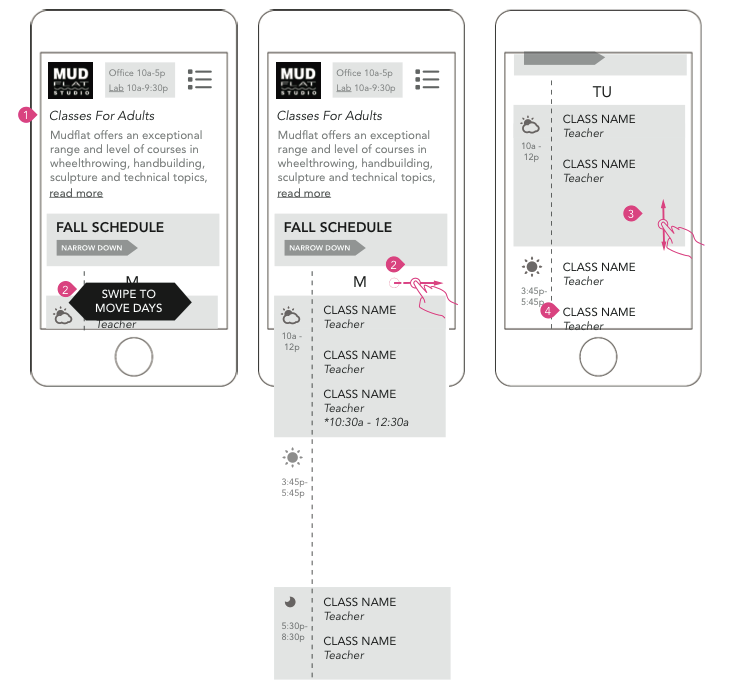
Improving Wayfinding and Conversion
The classes section proved to be an exciting user interface challenge! For prospecitve students, we wanted to show the full schedule at a glance and allow for easy identification of the level of class. For returning students, we wanted to prove an easy way to see class timing (many folks cited they can only take a class in the same timeslot each semester) and filtering by instructor as a large portion tend to develop a loyal connection to specific instructors.
Responsive Design
With 30% of traffic already on devices other than desktops, we wanted to ensure these features would responsively scale as well!
Visual Design
The old site did not reflect Mudflat's caliber of studio. With the new visual design, I sought to provide a bold and modern look to match the studio's logo. We also wanted to evoke the sense of space and modernity one feels when they work within the physical building. Additionally, we knew we'd have photography coming from multiple sources which could vary drastically in tone and color. To best support the collaborative photography, we wanted to keep the actual site palette simple and universally complimentary.
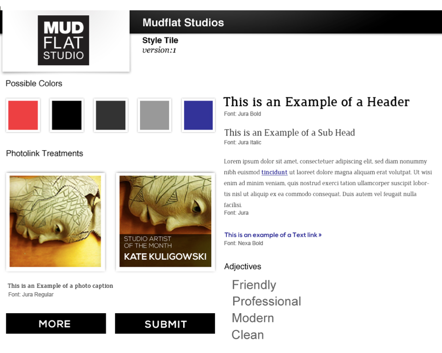
Initially, we narrowed the site's tone and styles via design tiles.
Download the wireframes and designs.